
To follow Owens suggestion, here are screenshots of my current polish items:
Folder icons for xdg folders in the file chooser: http://mclasen.fedorapeople.org/screenshots/xdg-folders-filechooser.png and in nautilus: http://mclasen.fedorapeople.org/screenshots/xdg-folders-nautilus.png
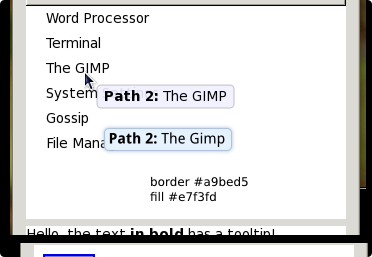
New tooltips look: http://mclasen.fedorapeople.org/screenshots/gedit-tooltip.png
Matthias

On Tue, 2009-10-20 at 19:33 -0400, Matthias Clasen wrote:
To follow Owens suggestion, here are screenshots of my current polish items:
Folder icons for xdg folders in the file chooser: http://mclasen.fedorapeople.org/screenshots/xdg-folders-filechooser.png and in nautilus: http://mclasen.fedorapeople.org/screenshots/xdg-folders-nautilus.png
New tooltips look: http://mclasen.fedorapeople.org/screenshots/gedit-tooltip.png
Thanks for giving the heads-up. Those look nice to me, BTW.

On 10/21/2009 02:33 AM, Matthias Clasen wrote:
To follow Owens suggestion, here are screenshots of my current polish items:
Folder icons for xdg folders in the file chooser: http://mclasen.fedorapeople.org/screenshots/xdg-folders-filechooser.png and in nautilus: http://mclasen.fedorapeople.org/screenshots/xdg-folders-nautilus.png
Don't you think the old "home" emblem should be also modified to be white to match those newly added? Or maybe make those dark blue, to fit "home", not sure how is best but consistency is good.

On 10/21/2009 01:33 AM, Matthias Clasen wrote:
To follow Owens suggestion, here are screenshots of my current polish items:
Folder icons for xdg folders in the file chooser: http://mclasen.fedorapeople.org/screenshots/xdg-folders-filechooser.png and in nautilus: http://mclasen.fedorapeople.org/screenshots/xdg-folders-nautilus.png
I like these, they look fancier ;-)
New tooltips look: http://mclasen.fedorapeople.org/screenshots/gedit-tooltip.png
I'm not sure I like the light-gray; how would light-blue look (that was your other suggestion, right?).
I've searched through gconf-editor on key names with tooltip in them but I didn't find any; is there a way I can try myself?
Thanks!
-- Jeroen
On Wed, 2009-10-21 at 09:38 +0200, Jeroen van Meeuwen wrote:
On 10/21/2009 01:33 AM, Matthias Clasen wrote:
To follow Owens suggestion, here are screenshots of my current polish items:
Folder icons for xdg folders in the file chooser: http://mclasen.fedorapeople.org/screenshots/xdg-folders-filechooser.png and in nautilus: http://mclasen.fedorapeople.org/screenshots/xdg-folders-nautilus.png
I like these, they look fancier ;-)
New tooltips look: http://mclasen.fedorapeople.org/screenshots/gedit-tooltip.png
I'm not sure I like the light-gray; how would light-blue look (that was your other suggestion, right?).
Umm. This was supposed to be the light blue. Maybe it is not blue enough...
I've searched through gconf-editor on key names with tooltip in them but I didn't find any; is there a way I can try myself?
You can play with colors in the appearance capplet (System > Preferences
Appearance), under Customize > Colors.

On 10/21/2009 07:04 AM, Matthias Clasen wrote:
I'm not sure I like the light-gray; how would light-blue look (that was your other suggestion, right?).
Umm. This was supposed to be the light blue. Maybe it is not blue enough...
I sent blue values to Jon last night (attached). #a9bed5 for the border, #e7f3fd for the fill. That screenshot you sent is definitely not blue; it's a pale purple.
~m
On Wed, 2009-10-21 at 09:26 -0400, Máirín Duffy wrote:
On 10/21/2009 07:04 AM, Matthias Clasen wrote:
I'm not sure I like the light-gray; how would light-blue look (that was your other suggestion, right?).
Umm. This was supposed to be the light blue. Maybe it is not blue enough...
I sent blue values to Jon last night (attached). #a9bed5 for the border, #e7f3fd for the fill. That screenshot you sent is definitely not blue; it's a pale purple.
You may need to take of the pink glasses ? :-)
Anyway, I have put some more work into this (also making metacity tooltips follow this style, and make the metacity compositor not put a shadow on the shaped tooltips). New builds are in koji:
gtk2-2.8.3-6.fc12 gtk2-engines-2.18.4-3.fc12 metacity-2.28.0-4.fc12
if you want to try them out.
Thanks for the feedback.
On Wed, 2009-10-21 at 18:18 -0400, Matthias Clasen wrote:
On Wed, 2009-10-21 at 09:26 -0400, Máirín Duffy wrote:
On 10/21/2009 07:04 AM, Matthias Clasen wrote:
I'm not sure I like the light-gray; how would light-blue look (that was your other suggestion, right?).
Umm. This was supposed to be the light blue. Maybe it is not blue enough...
I sent blue values to Jon last night (attached). #a9bed5 for the border, #e7f3fd for the fill. That screenshot you sent is definitely not blue; it's a pale purple.
You may need to take of the pink glasses ? :-)
I *really* hope everyone working on this is using a properly colour-calibrated display?
On Wed, 21 Oct 2009 15:30:09 -0700, Adam Williamson awilliam@redhat.com wrote:
On Wed, 2009-10-21 at 18:18 -0400, Matthias Clasen wrote:
You may need to take of the pink glasses ? :-)
I *really* hope everyone working on this is using a properly colour-calibrated display?
It looks like some kind of calibration on my other laptop is in order. It is clearly grey on this laptop (not blue either though.) But, I'm not sure how to calibrate it. :(
Um, if all my designs are a little too pink in the future, it's not the Hello Kitty thing, really!
~m
On Wed, 2009-10-21 at 19:57 -0400, Máirín Duffy wrote:
On Wed, 21 Oct 2009 15:30:09 -0700, Adam Williamson awilliam@redhat.com wrote:
On Wed, 2009-10-21 at 18:18 -0400, Matthias Clasen wrote:
You may need to take of the pink glasses ? :-)
I *really* hope everyone working on this is using a properly colour-calibrated display?
It looks like some kind of calibration on my other laptop is in order. It is clearly grey on this laptop (not blue either though.) But, I'm not sure how to calibrate it. :(
Um, if all my designs are a little too pink in the future, it's not the Hello Kitty thing, really!
http://en.wikipedia.org/wiki/Linux_color_management looks like a decent reference. Note that doing really reliable calibration requires some hardware. Perhaps getting a single colorimeter to pass around all the people within Fedora who are likely to be messing with colors would not be a bad idea.
You can do rough ballpark calibration without hardware, and how to do it is pretty well detailed in this Dan's Data post:
http://www.dansdata.com/spyder.htm
under the heading 'Alternatives'.
Note that this is a case of do-as-I-say-not-as-I-do, because my two monitors and laptop are all cheerfully different from each other. But then, I don't do any graphic design =). For those who are working with colors, having a properly-calibrated display is pretty key.
On Wed, 2009-10-21 at 17:25 -0700, Adam Williamson wrote:
On Wed, 2009-10-21 at 19:57 -0400, Máirín Duffy wrote:
On Wed, 21 Oct 2009 15:30:09 -0700, Adam Williamson awilliam@redhat.com wrote:
On Wed, 2009-10-21 at 18:18 -0400, Matthias Clasen wrote:
You may need to take of the pink glasses ? :-)
I *really* hope everyone working on this is using a properly colour-calibrated display?
It looks like some kind of calibration on my other laptop is in order. It is clearly grey on this laptop (not blue either though.) But, I'm not sure how to calibrate it. :(
Um, if all my designs are a little too pink in the future, it's not the Hello Kitty thing, really!
http://en.wikipedia.org/wiki/Linux_color_management looks like a decent reference. Note that doing really reliable calibration requires some hardware. Perhaps getting a single colorimeter to pass around all the people within Fedora who are likely to be messing with colors would not be a bad idea.
You can do rough ballpark calibration without hardware, and how to do it is pretty well detailed in this Dan's Data post:
http://www.dansdata.com/spyder.htm
under the heading 'Alternatives'.
Note that this is a case of do-as-I-say-not-as-I-do, because my two monitors and laptop are all cheerfully different from each other. But then, I don't do any graphic design =). For those who are working with colors, having a properly-calibrated display is pretty key.
Just to go back to this, in a moment of serendipity, hughsie happens to be working on exactly this:
http://blogs.gnome.org/hughsie/2009/10/28/gnome-color-manager/

On Tue, 2009-10-20 at 19:33 -0400, Matthias Clasen wrote:
To follow Owens suggestion, here are screenshots of my current polish items:
Folder icons for xdg folders in the file chooser: http://mclasen.fedorapeople.org/screenshots/xdg-folders-filechooser.png and in nautilus: http://mclasen.fedorapeople.org/screenshots/xdg-folders-nautilus.png
As Nicu pointed, these are inconsistent with the home folder, other than that they look nice :)
New tooltips look: http://mclasen.fedorapeople.org/screenshots/gedit-tooltip.png
The rounded corners are sorta odd (probably because you are faking transparency), you could probably use rounded corners only if you have compositing manager?. The grey colour doesn't stand out so it's harder to spot the tooltip.
Martin
desktop@lists.fedoraproject.org
-
 Adam Williamson
 -
 Jeroen van Meeuwen
 -
 Martin Sourada
 -
 Matthias Clasen
 -
 Máirín Duffy
 -
 Nicu Buculei